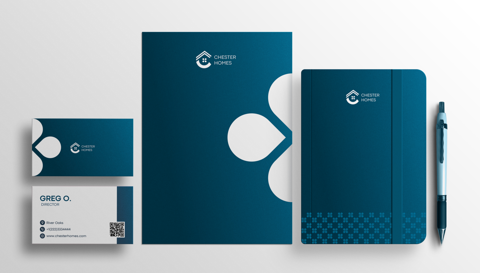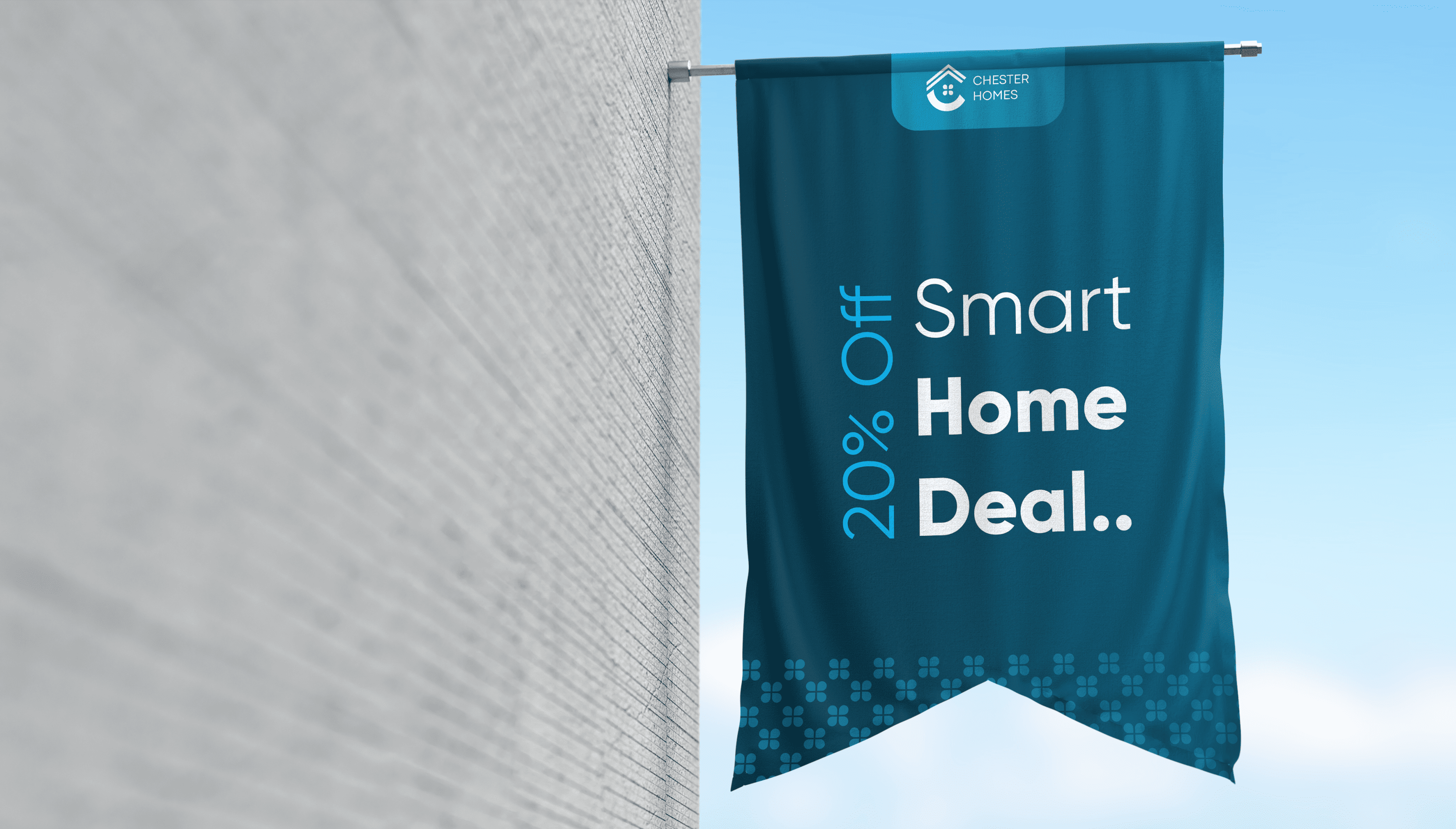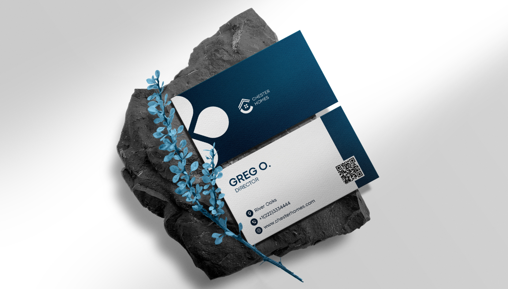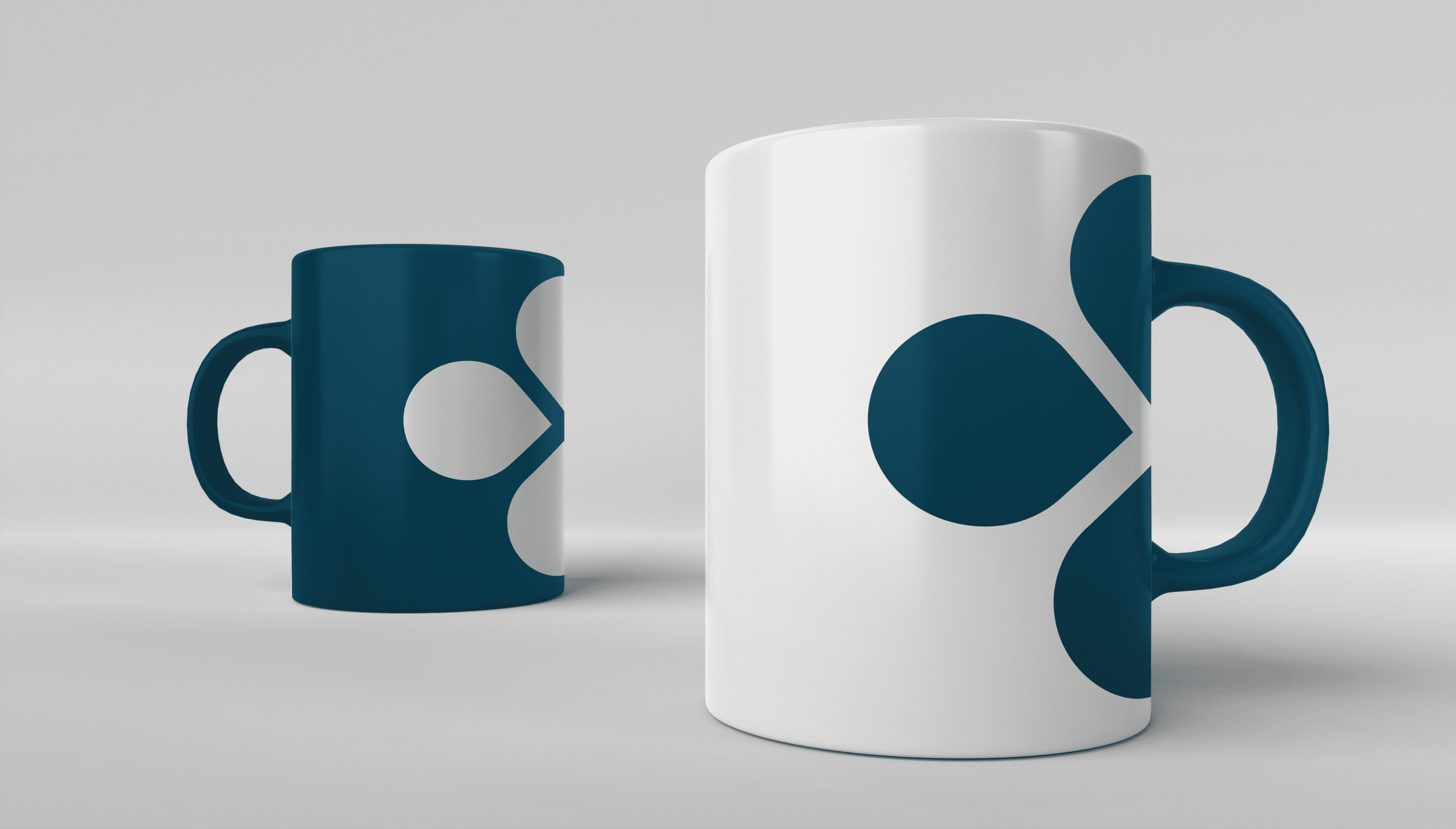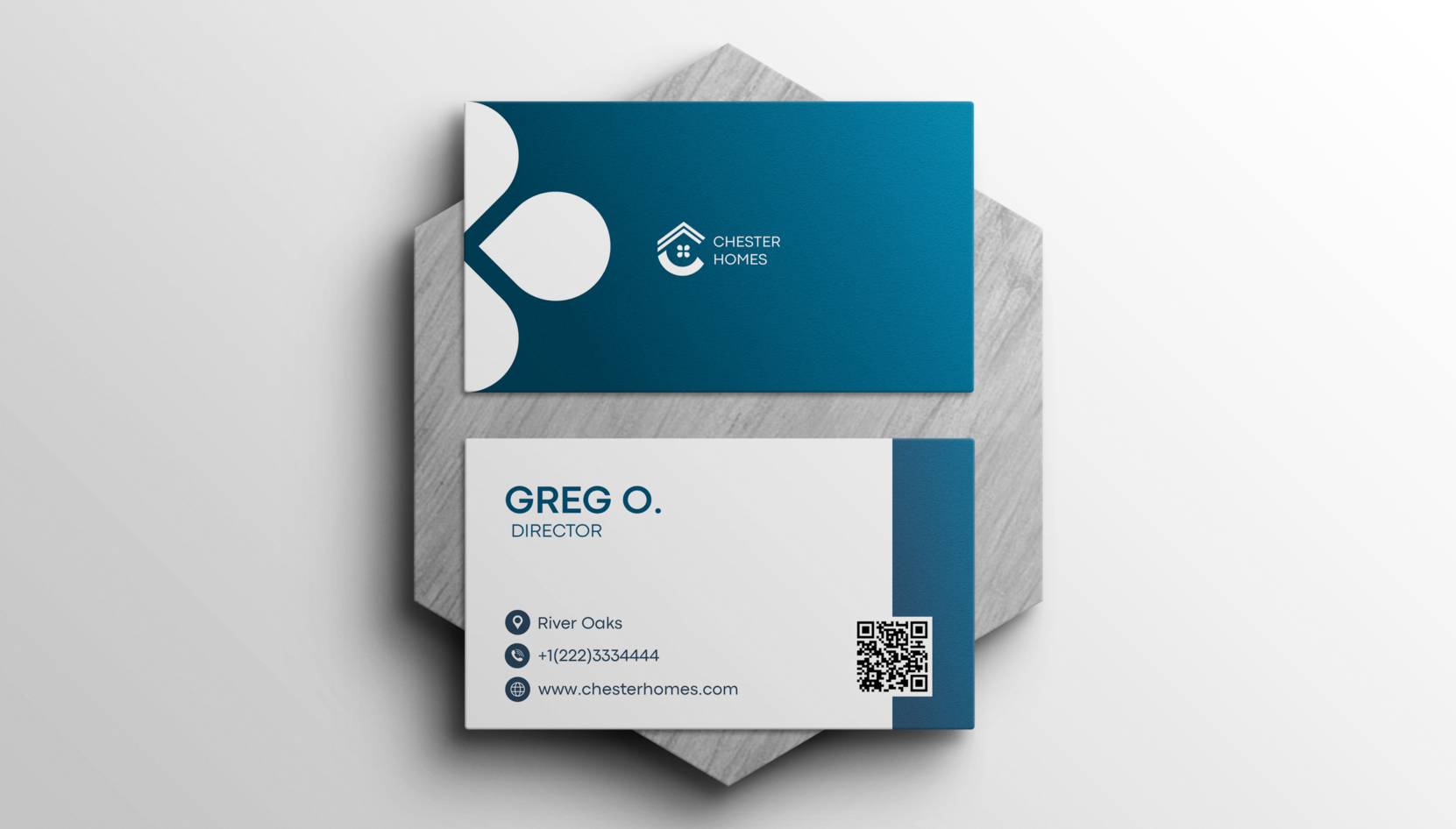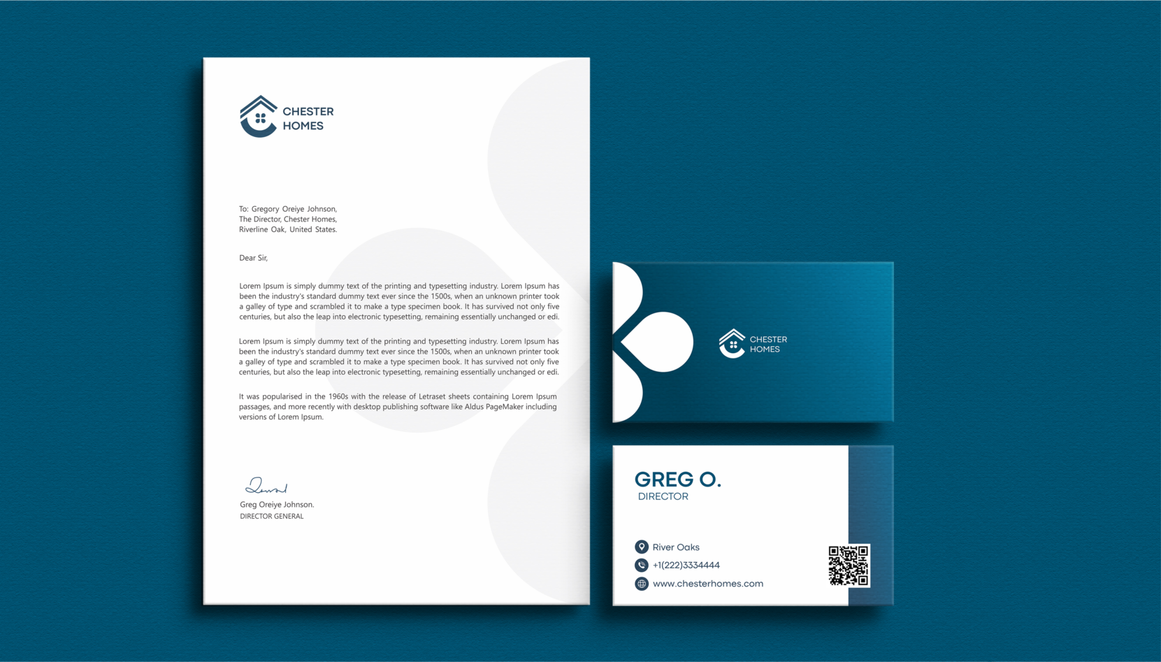
The real estate firm Chester Homes offers clients full-service, custom, and luxurious homes. The company’s achievements, from the initial designs to the finished product, speak for themselves. Through the incorporation of cutting-edge architecture and technology in the buildings, the team of specialists in place has prioritized providing top-notch services to clients.

The brand identity is built around the letter C, which is the initials of the brand name “Chester Homes,” and a roof. The design is associated with quality, professionalism, and elegance, which will help improve the way the company is perceived.

COLOR
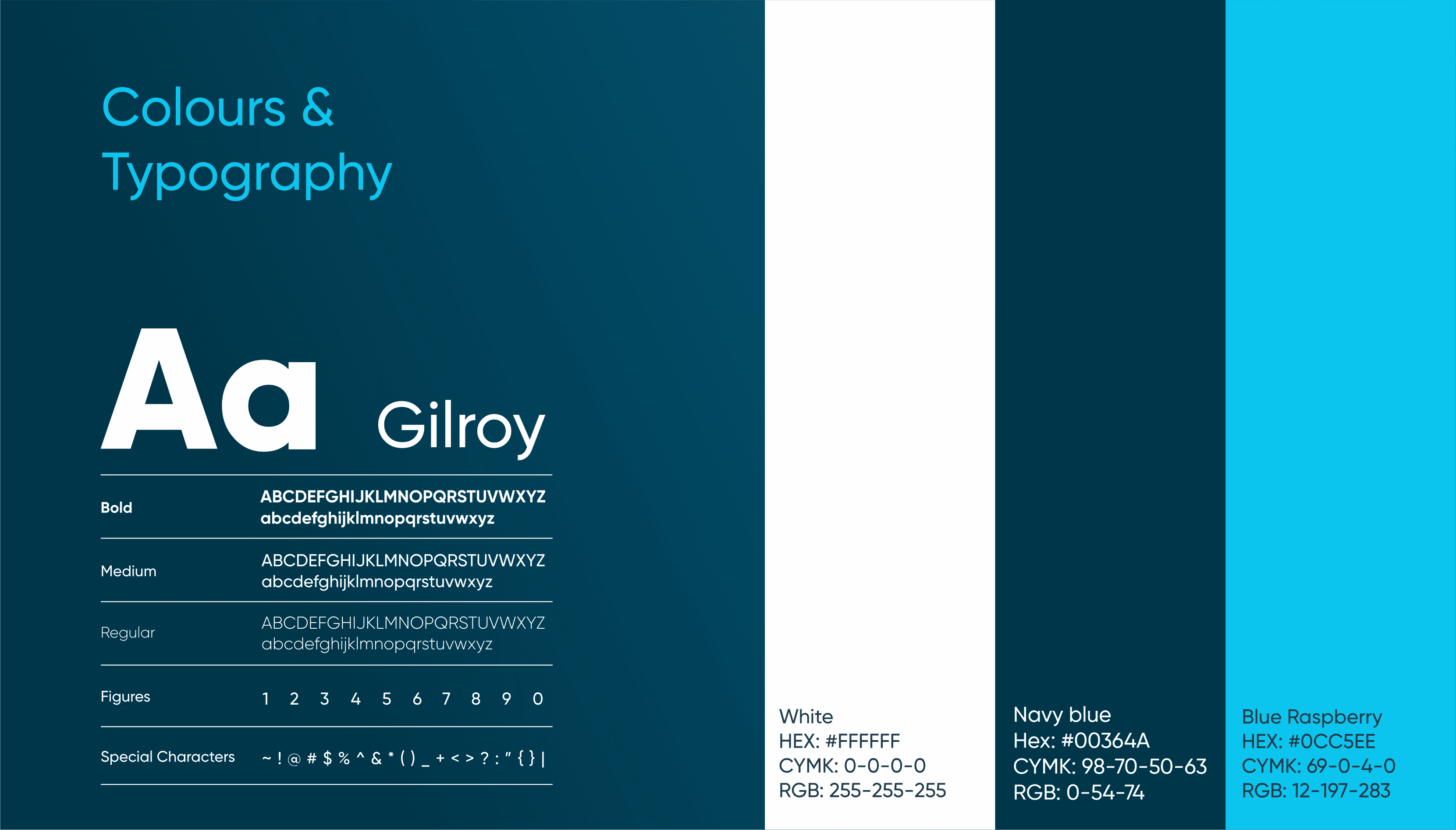
Color is an important consideration in brand identity. Colors have a significant impact on people’s emotional states. They have also been shown to impact people’s ability to concentrate and learn about a brand.
The primary colors (Navy Blue and White) and a secondary color (Blue Raspberry) will match the brand vision and mission and also look appealing to the target clients.
LOGO VARIATION
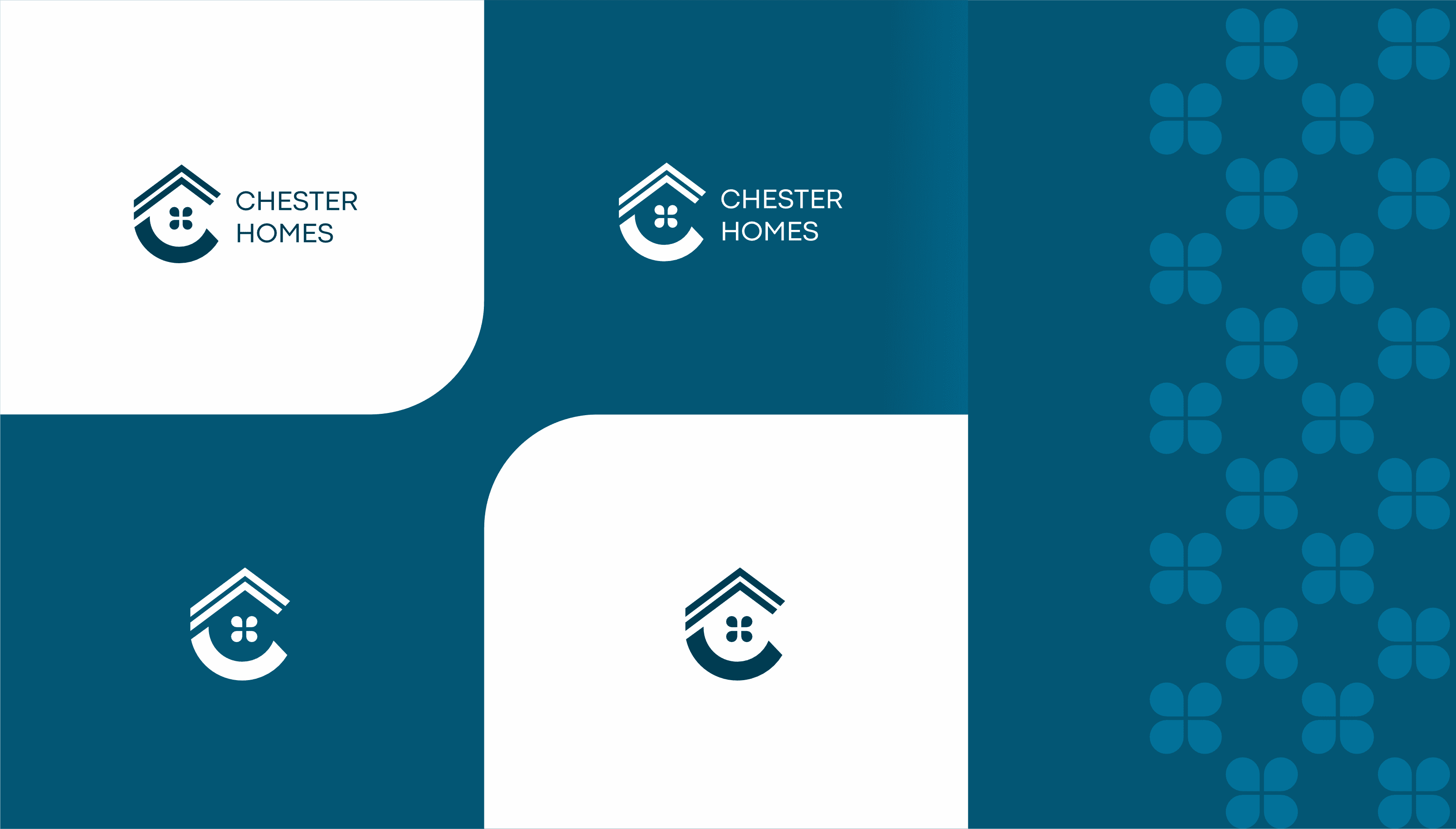
Having various logo variations guarantees that the brand is consistent across all design collateral and online channels. Variations are created to accommodate different mediums or applications. Each logo variant is used in a variety of applications.
Chester Homes delivers visuals that immediately distinguish the brand by utilizing its key colors and visual components throughout. These characteristics are employed to convey a unique and expert vibe, further conveying the brand’s essential principles.
VISUAL LANGUAGE
We kept the essentials in mind while developing the design components in a contemporary manner. We looked at original and distinctive design options for the visual language.
