THE BRAND
Marathon Property is a rapidly growing real estate company with the aim of developing unparalleled residential compounds, commercial areas, and business buildings. Over the past 10 years, Marathon Property Developments has consistently focused on building communities in the United States. With six residential compounds, various commercial projects, and many business buildings already developed, Marathon Property has proven itself to be a major leader in the industry and is committed to building a bigger and brighter future.
THE TASK
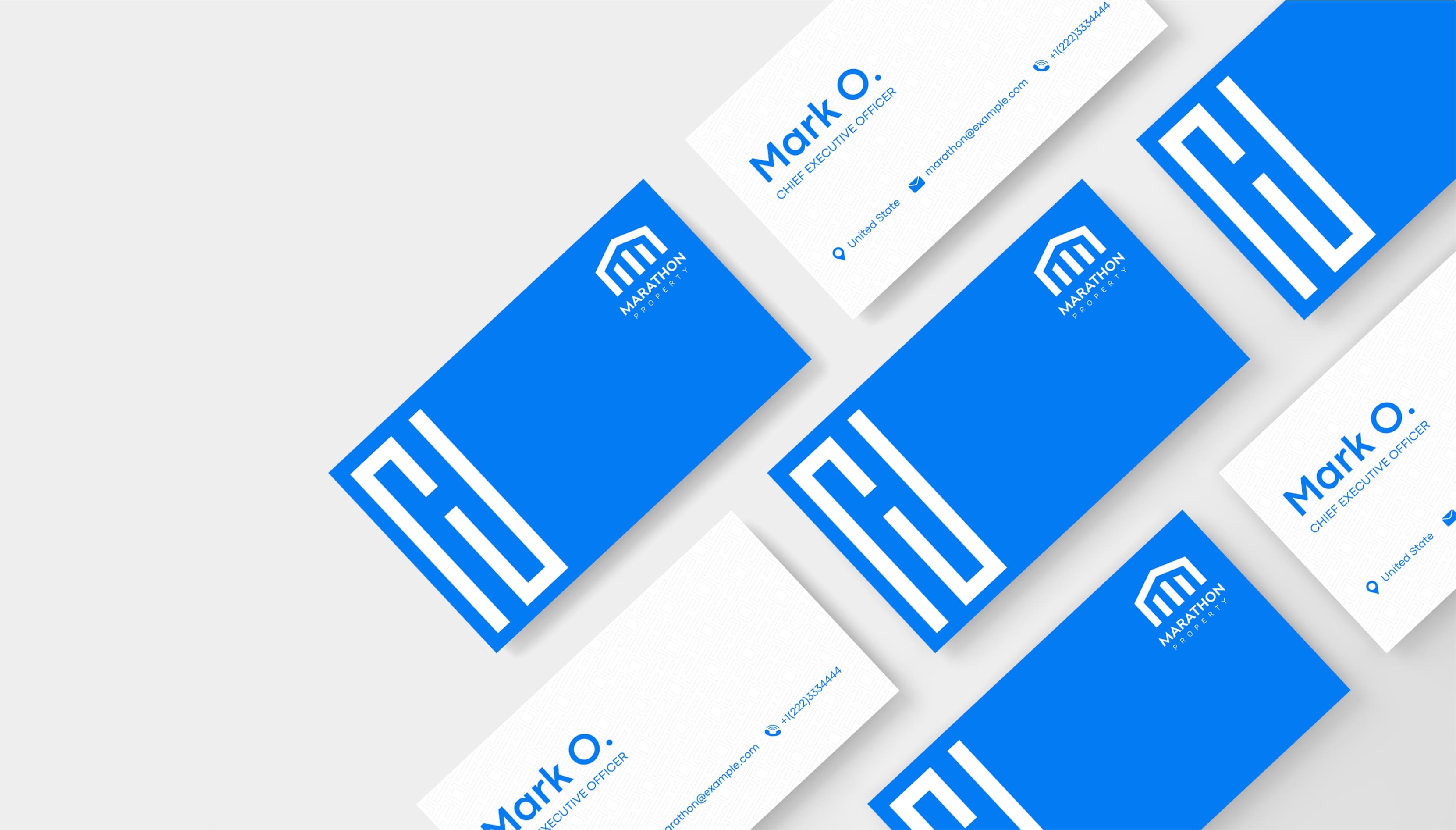
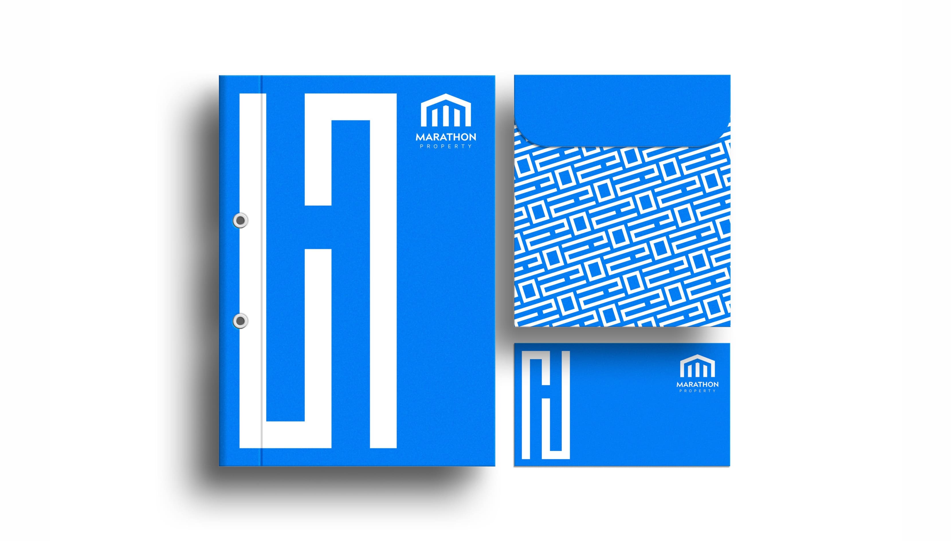
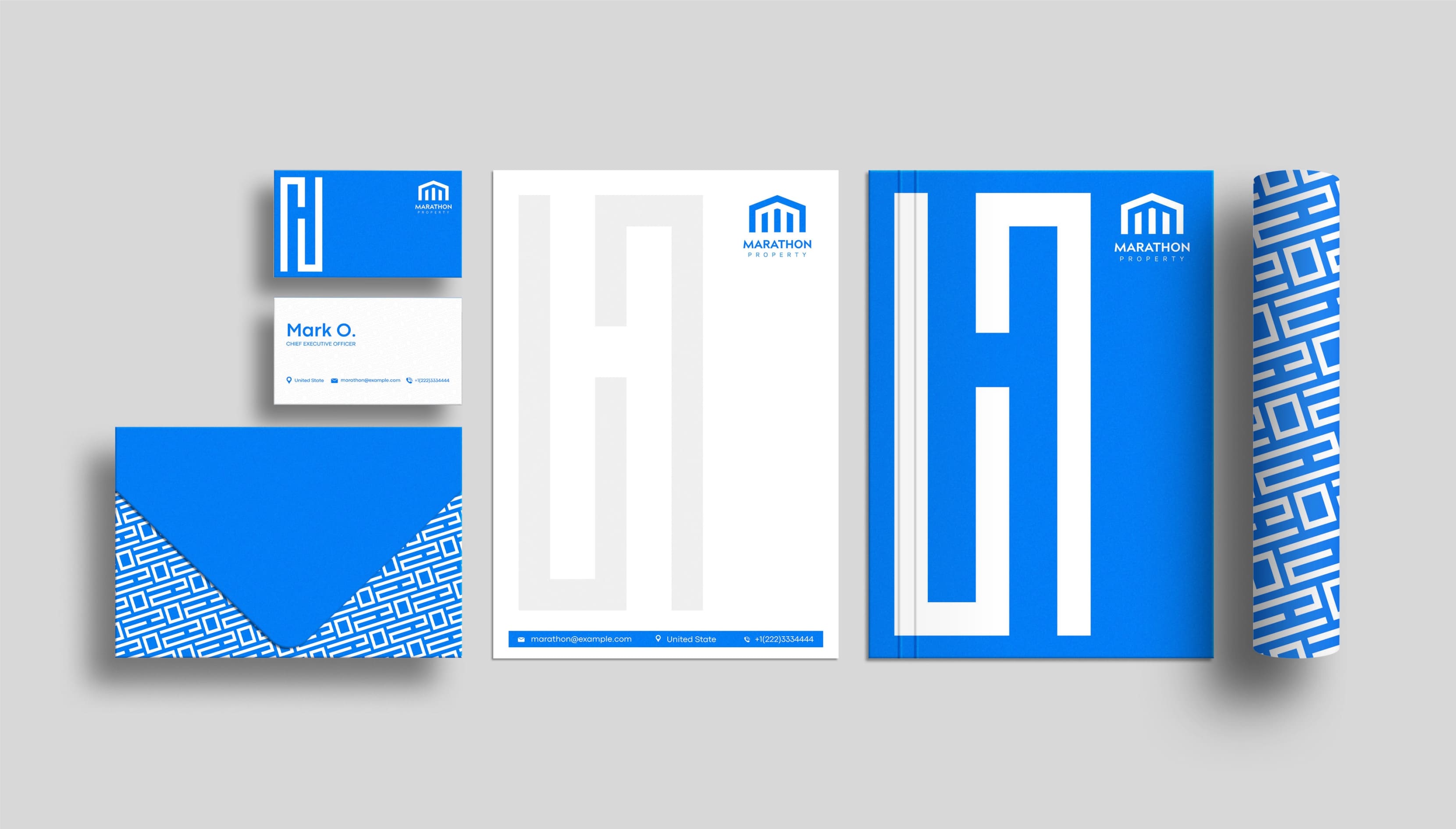
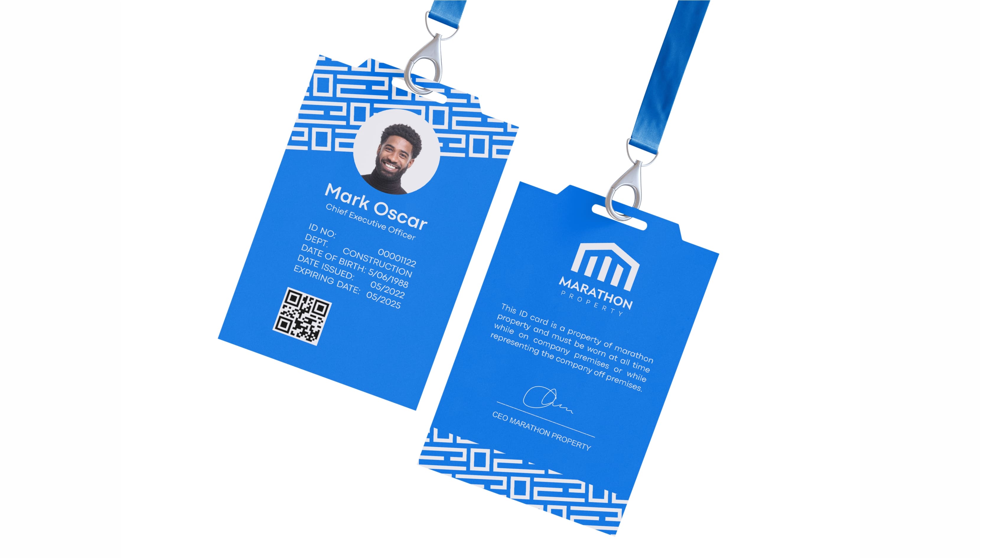
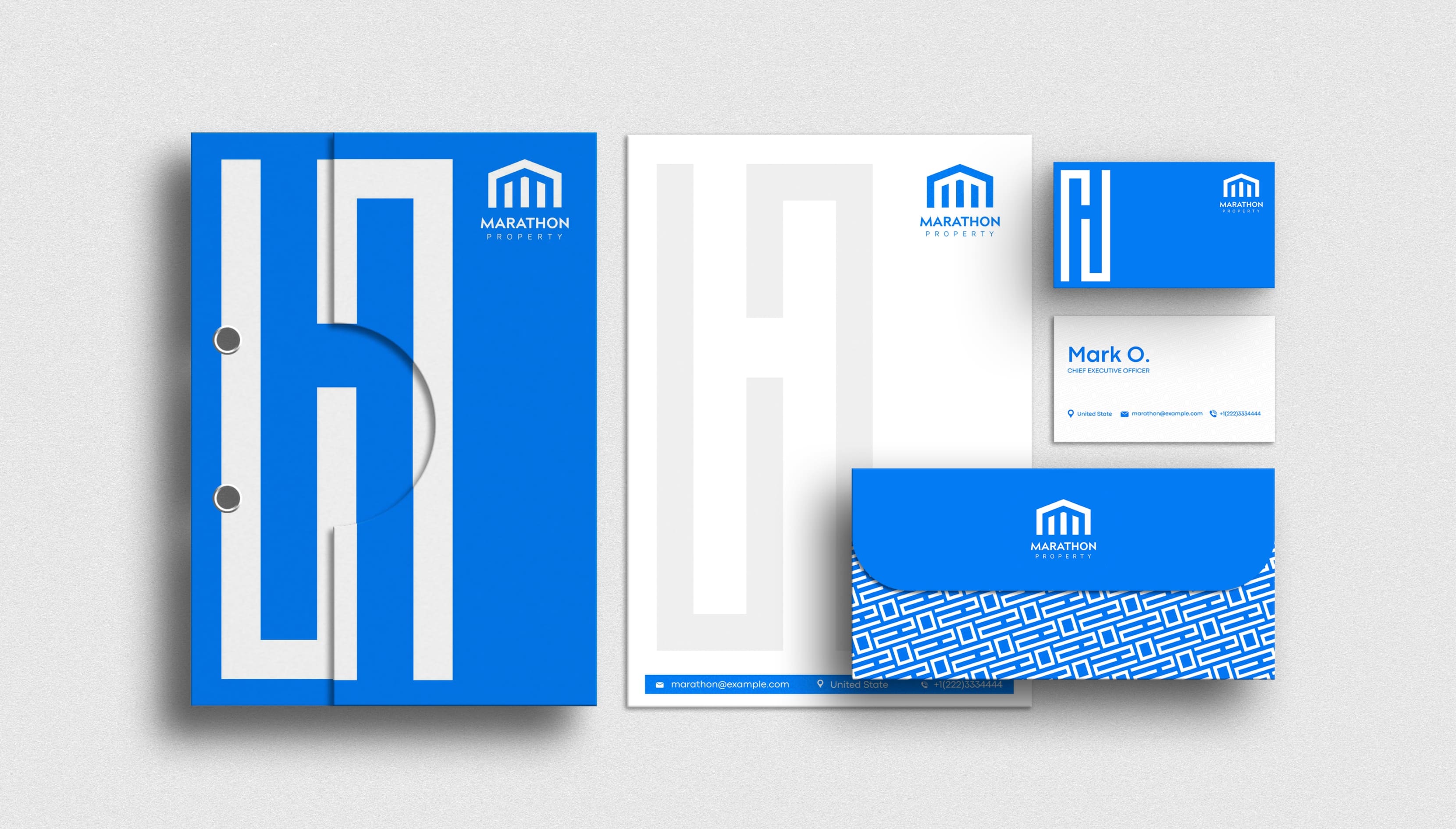
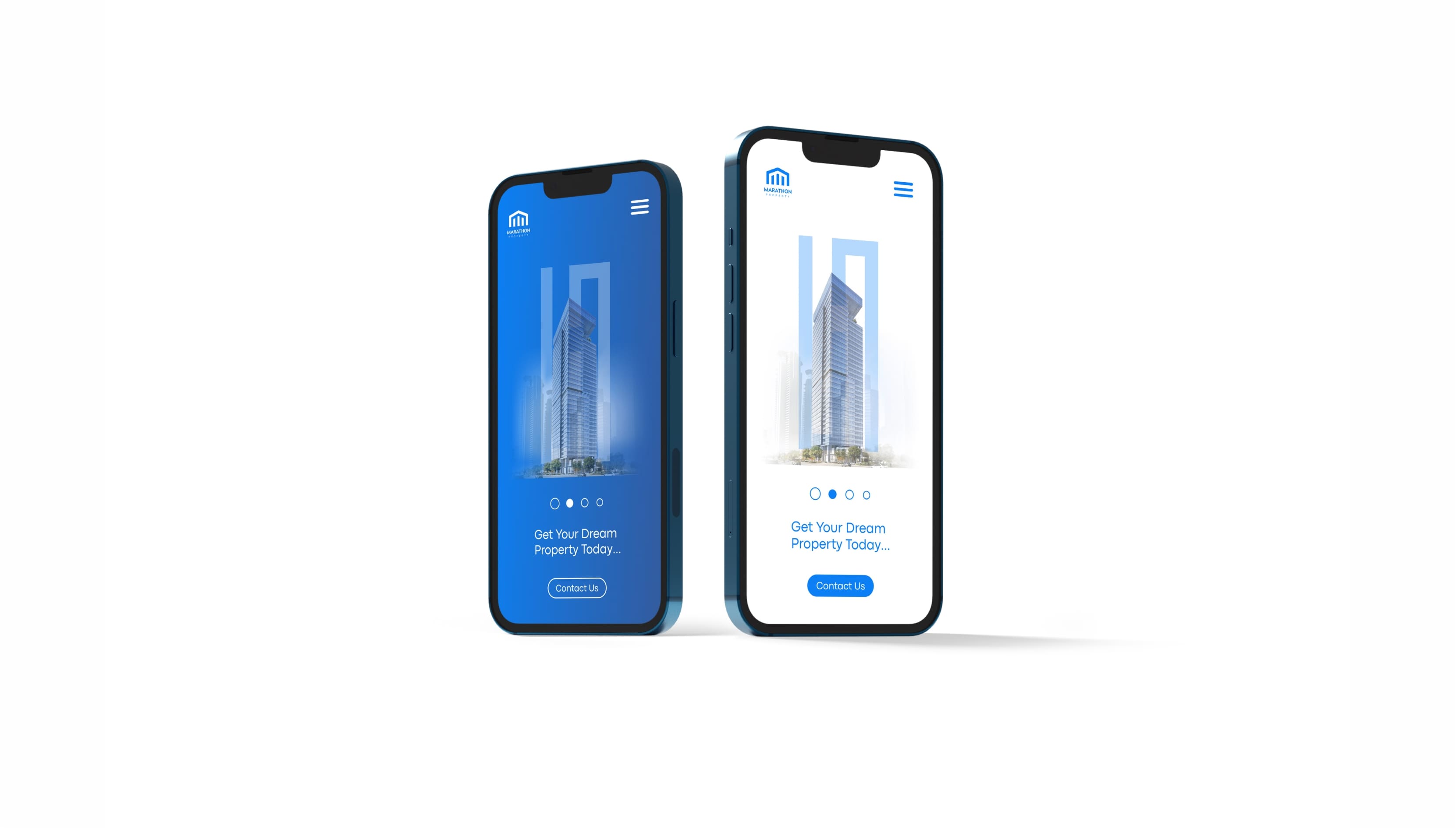
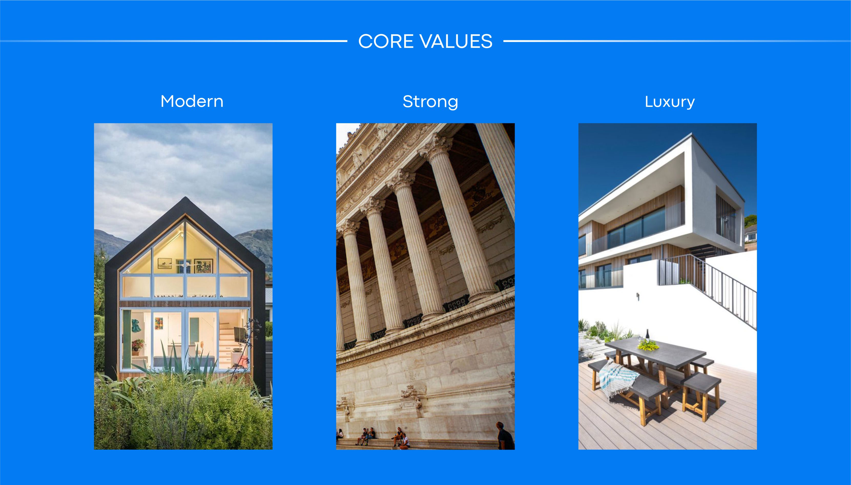
The task was to create a brand identity and promotional materials with a focus on its core values (modern, strong, and luxurious).
THE SOLUTION
The solution is to discover the characteristics that define Marathon Property, learn who or what Marathon Property is and what emotions it evokes, and then develop a unified design language that is unique to Marathon Property—one that is easy to identify, memorable, and aligns with Marathon Property’s values.
APPROACH
I was able to learn how to portray Marathon Property as a human by engaging stakeholders and employees in a brand discovery session. We discovered keywords and values that align with Marathon Property. Discovering the why and backstory of Marathon Property influenced how I approached the project.
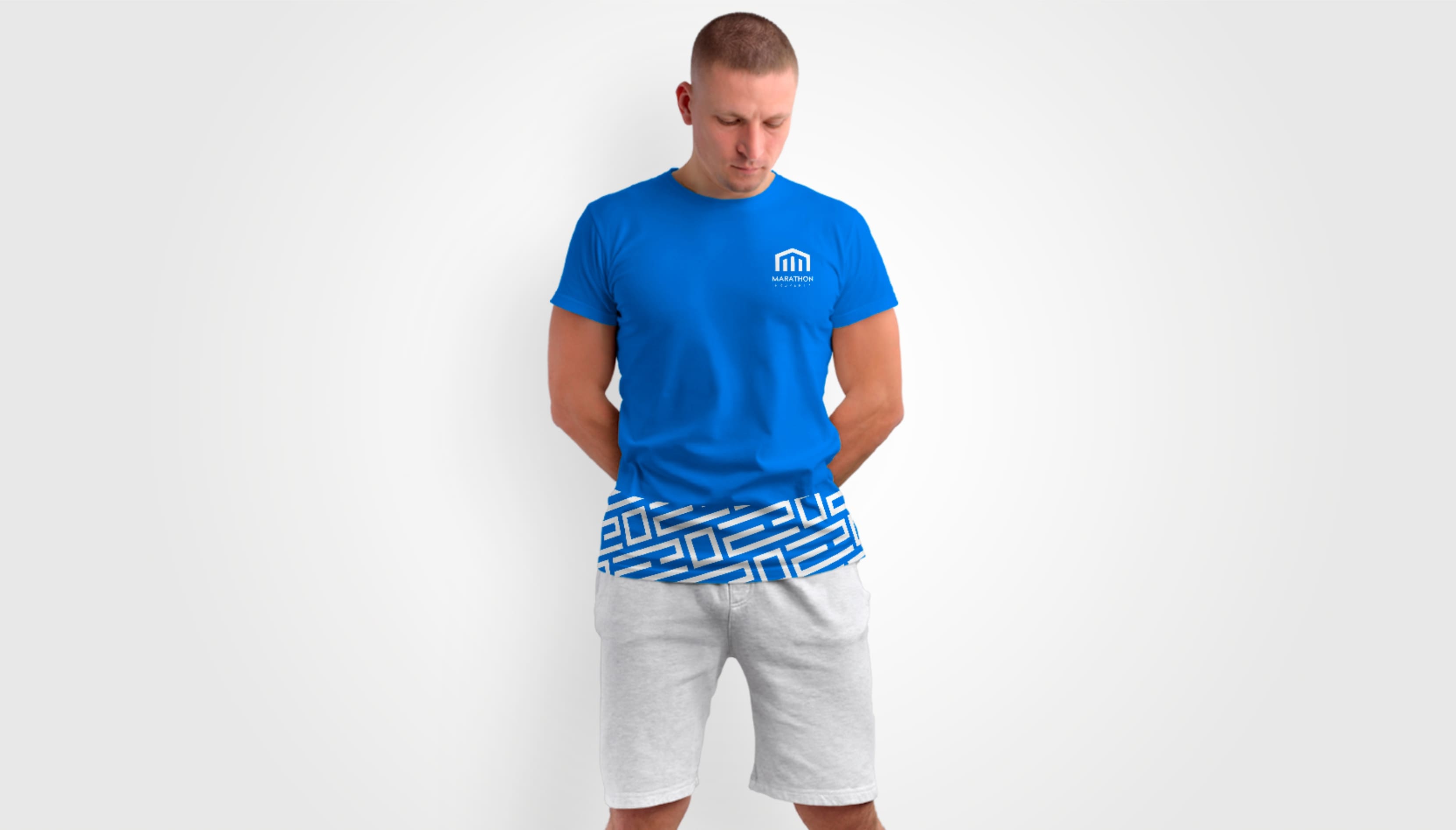
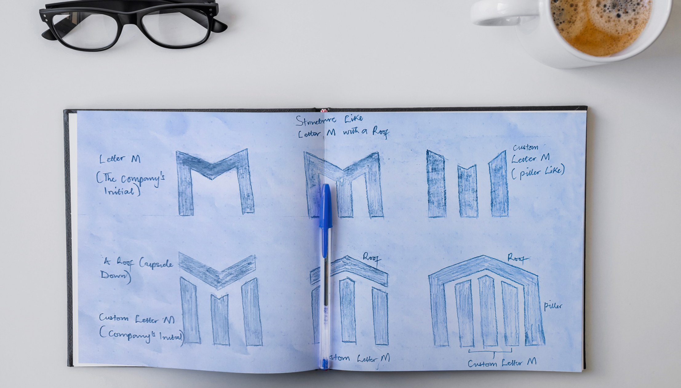
During my first call, I took notes on keywords related to Marathon Property; modern, strong, and luxury are major keywords that I chose to work with by transforming the “Brand Initial Letter (M),” which also represents one of the core values (modern), and pillars representing (strong), while the primary color represents comfort or luxury.

COLOR
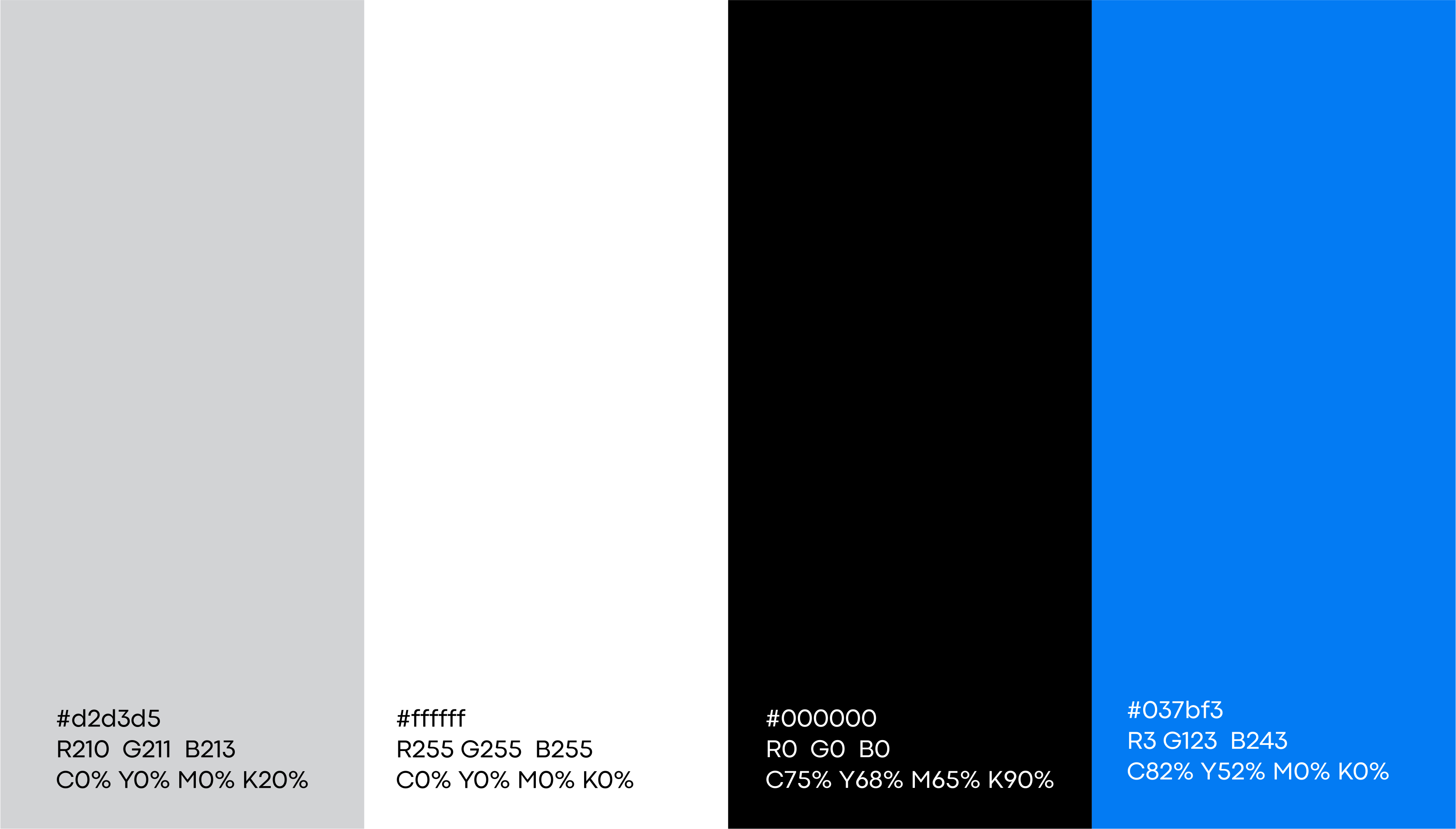
The color still aligns with Marathon Property’s personality and values, and it’s unique to the brand. Blue and white are two complementary colors that have a calm feeling attached to them. This, I believe, aids the brand in being perceived as comfortable or luxurious.
We also created a secondary color system that will complement the primary color at certain instances in the brand identity design.
BRAND PERSONALITY
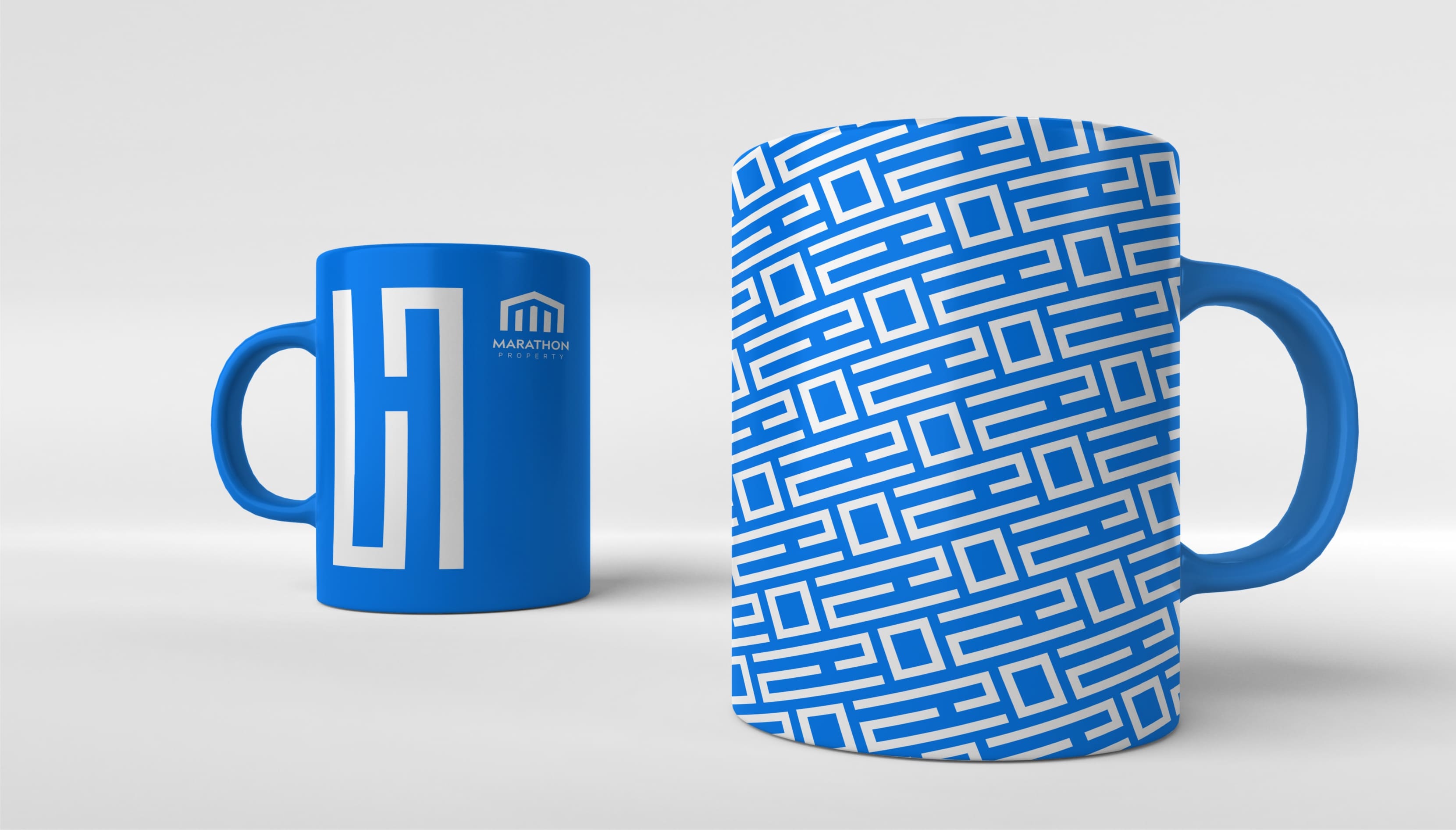
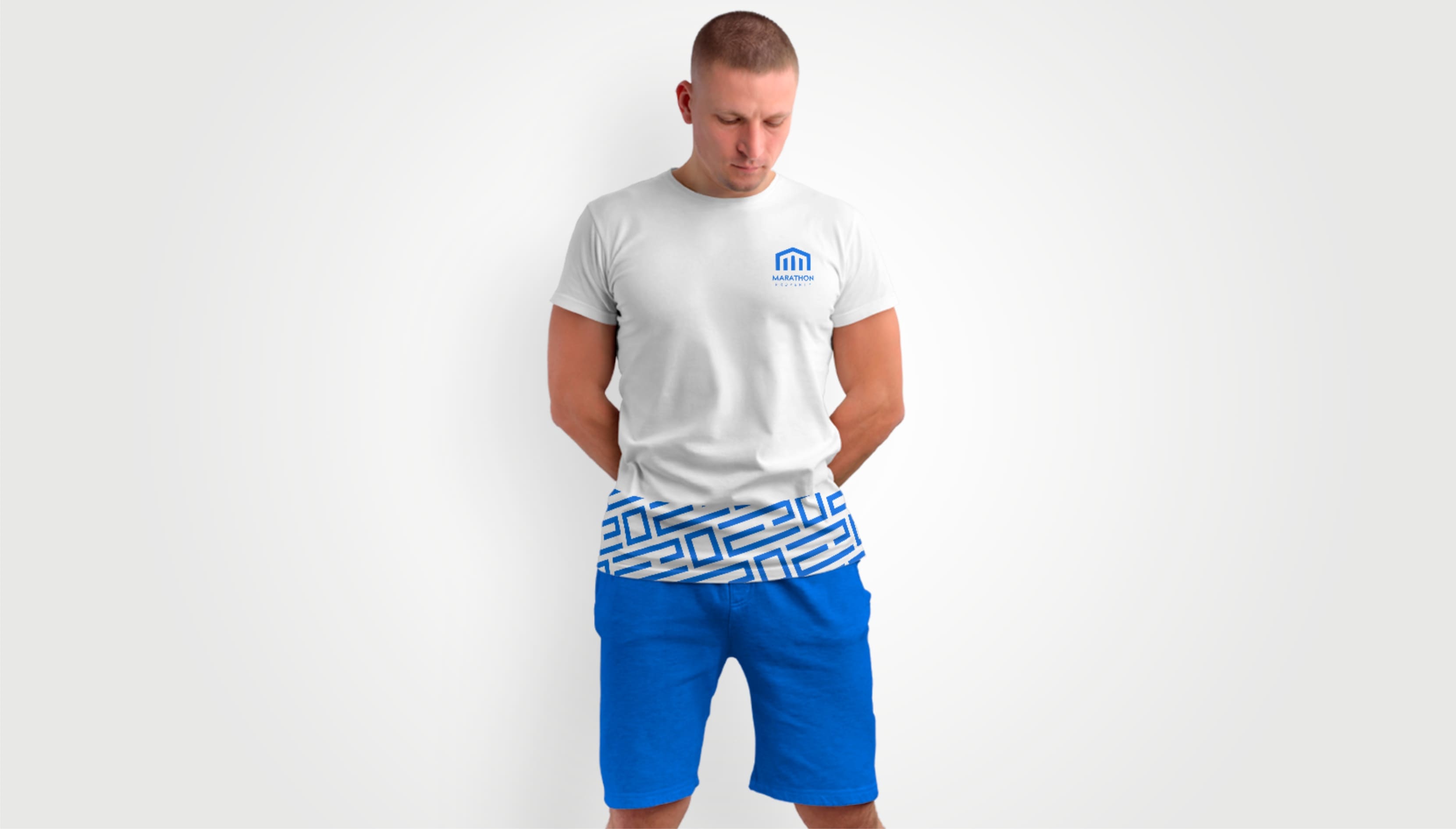
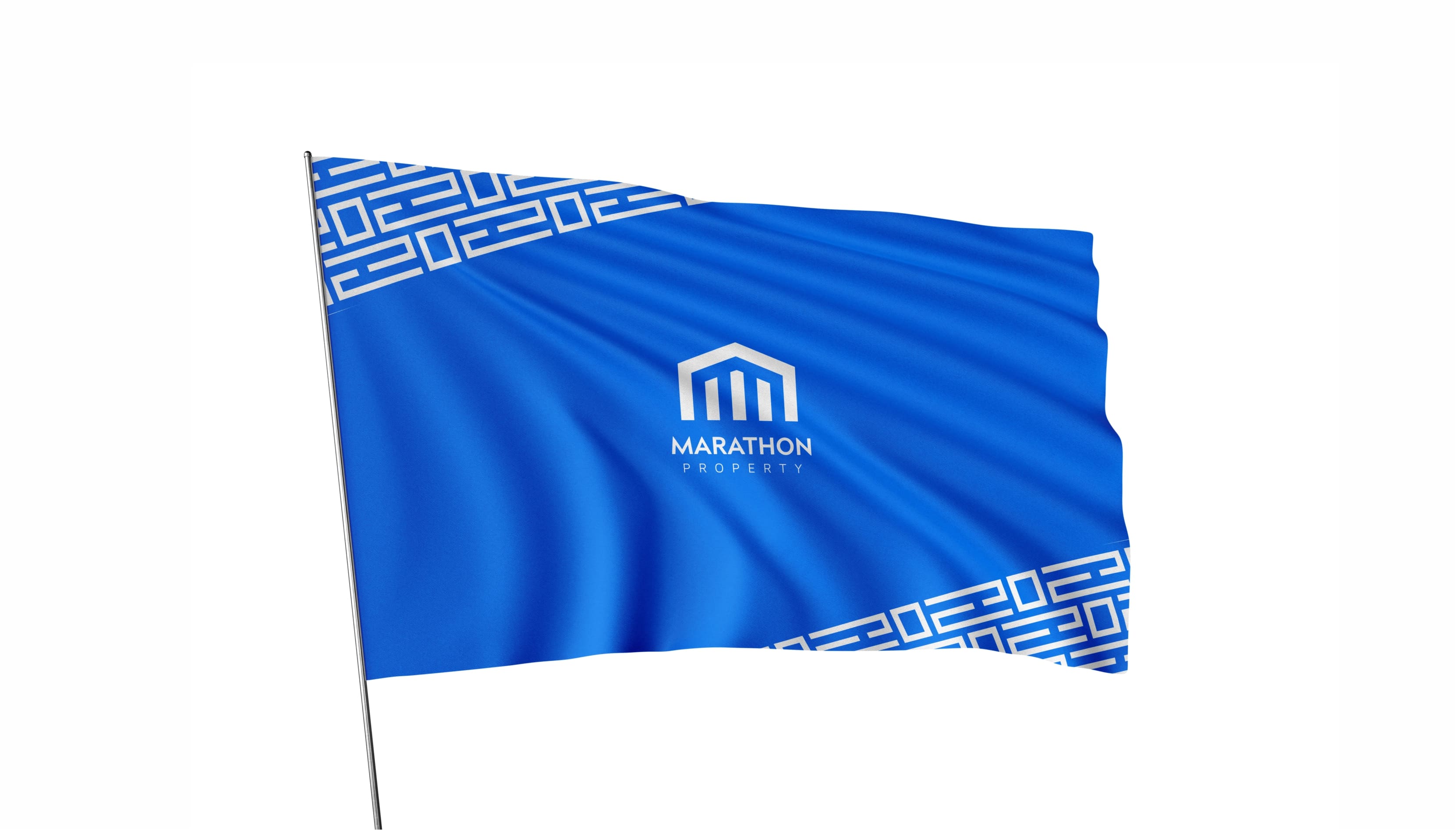
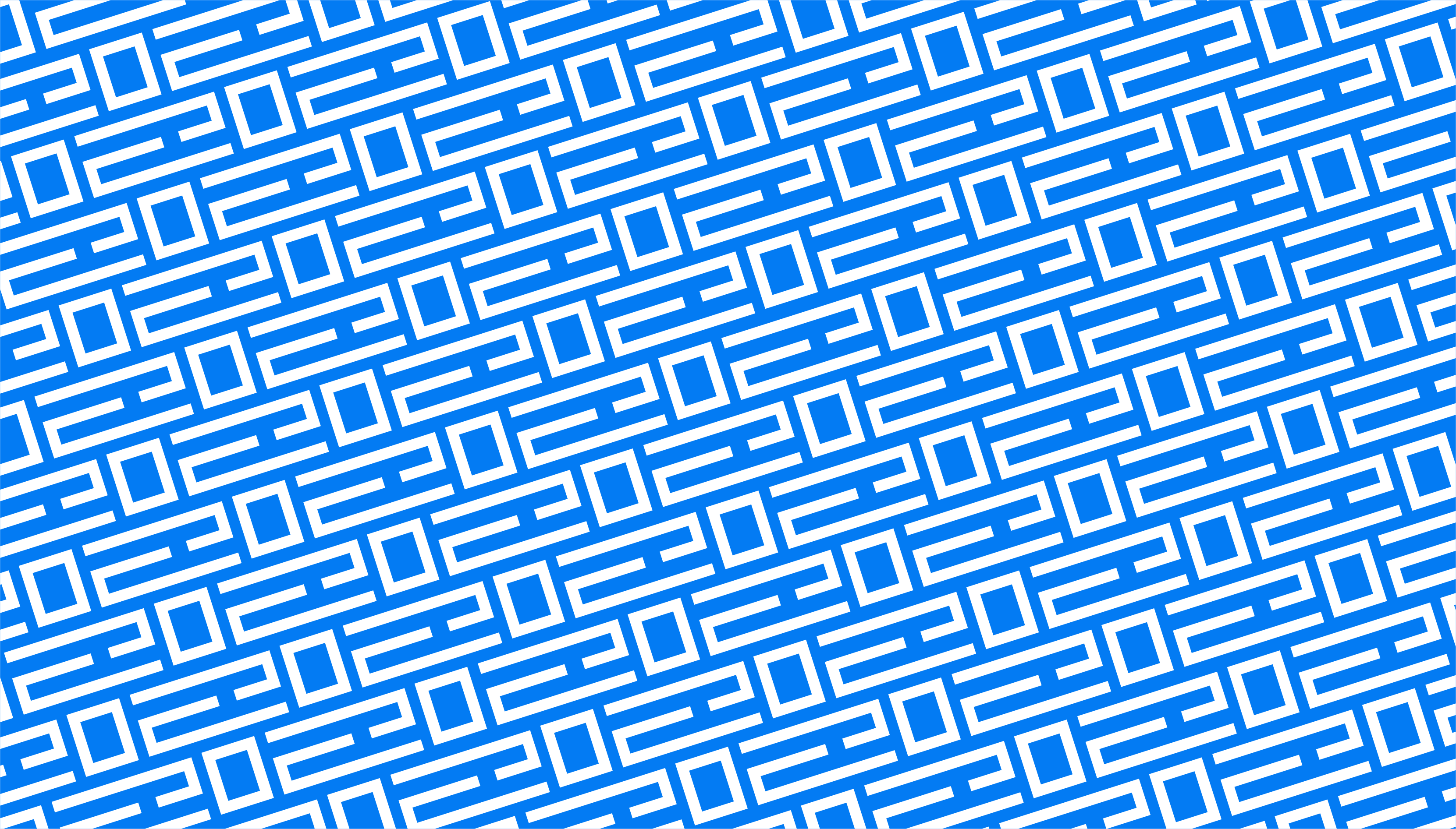
Marathon Property is portrayed as strong, modern, and comfortable—these are the words by which I chose the typography. It also guided me in choosing the best pattern for the brand.
LOGO VARIATION
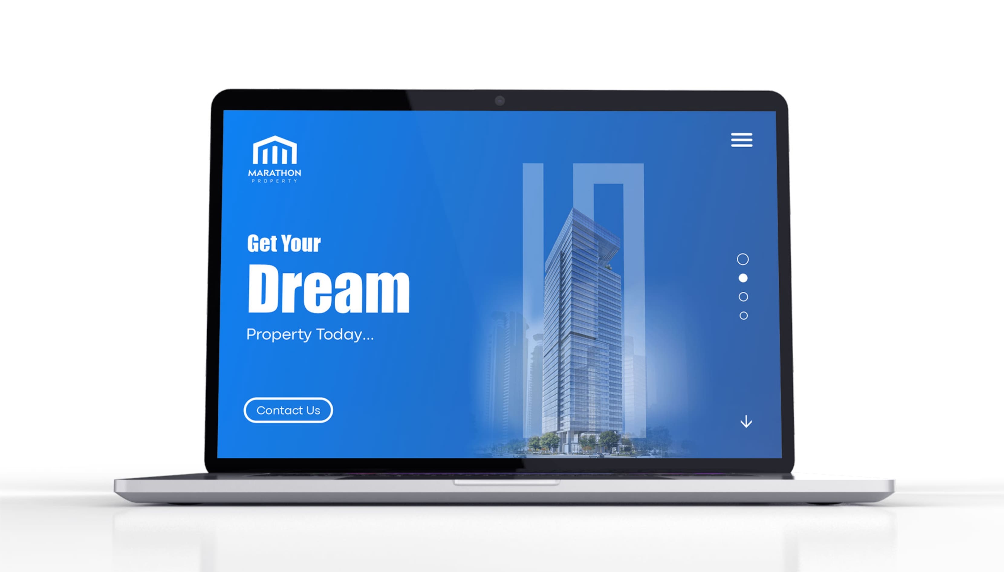
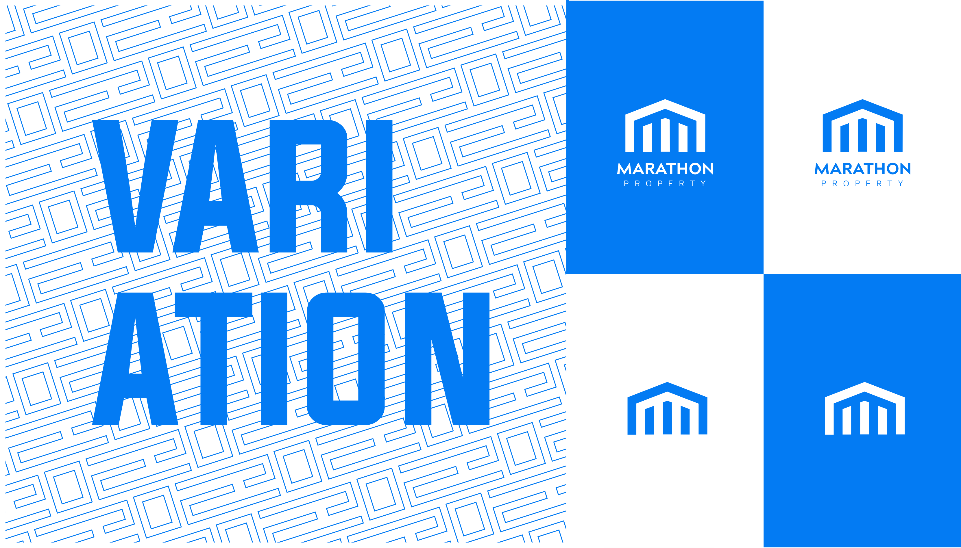
The variations are created to suit different mediums or usage, and having multiple logo variations ensures the brand is consistent across all design collateral and online platforms. Each logo variation is used in different ways.
VISUAL LANGUAGE
We have developed the design elements in a modern way while keeping the essentials. We explored both unique and memorable design directions for the visual language.
