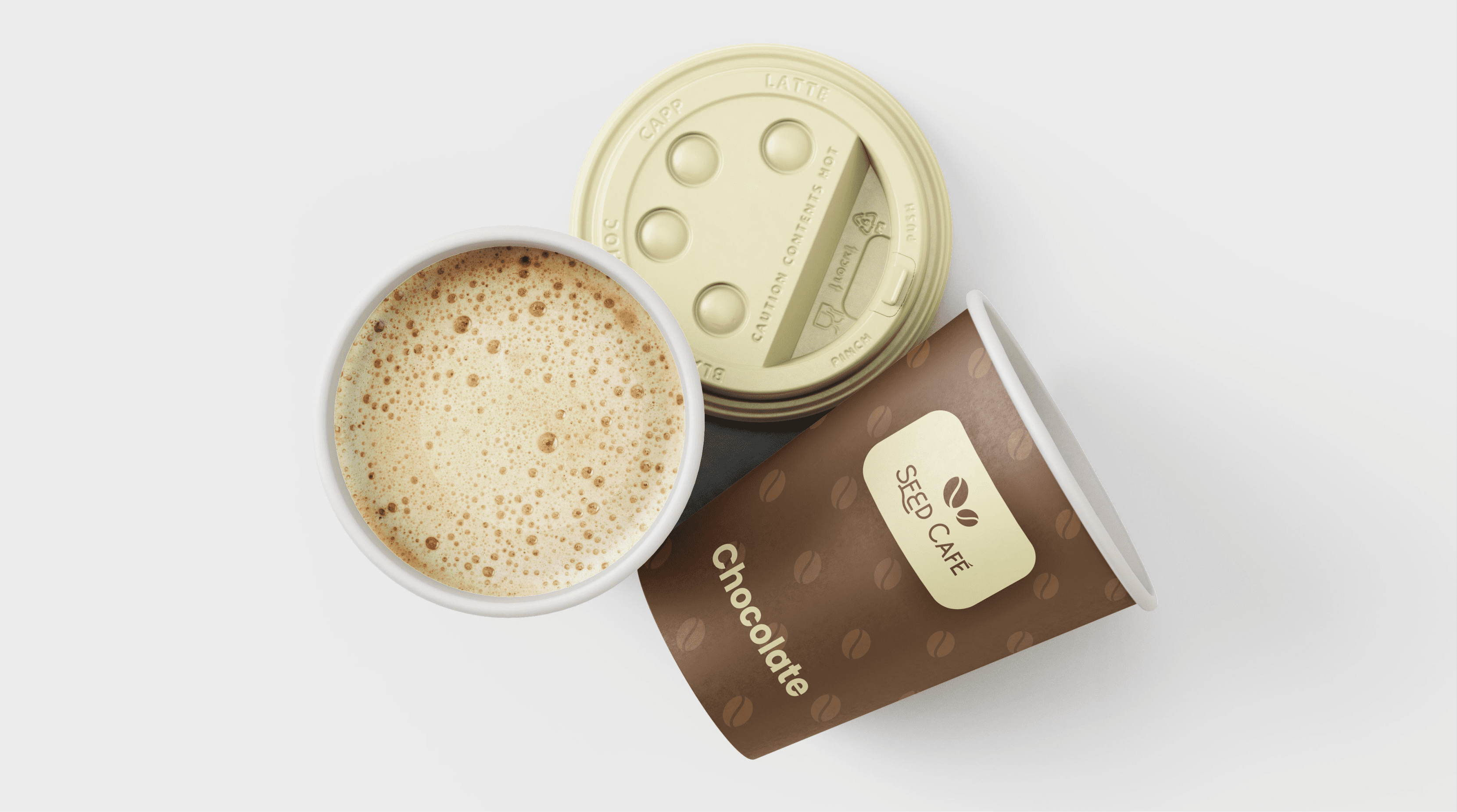
SEED CAFÉ
Seed Café is an aesthetically pleasing coffee shop in Minneapolis, Minnesota, offering a diverse selection of coffee. It incorporates warm color blends, calm settings, and warm lighting. The café vibes are self-explanatory; they include lots of coffee, calmness, and relaxation with absolutely no place to have to be, and feeling as if time is standing still.
KEYWORDS
Coffee | simple | Unique | calm
STRATEGY
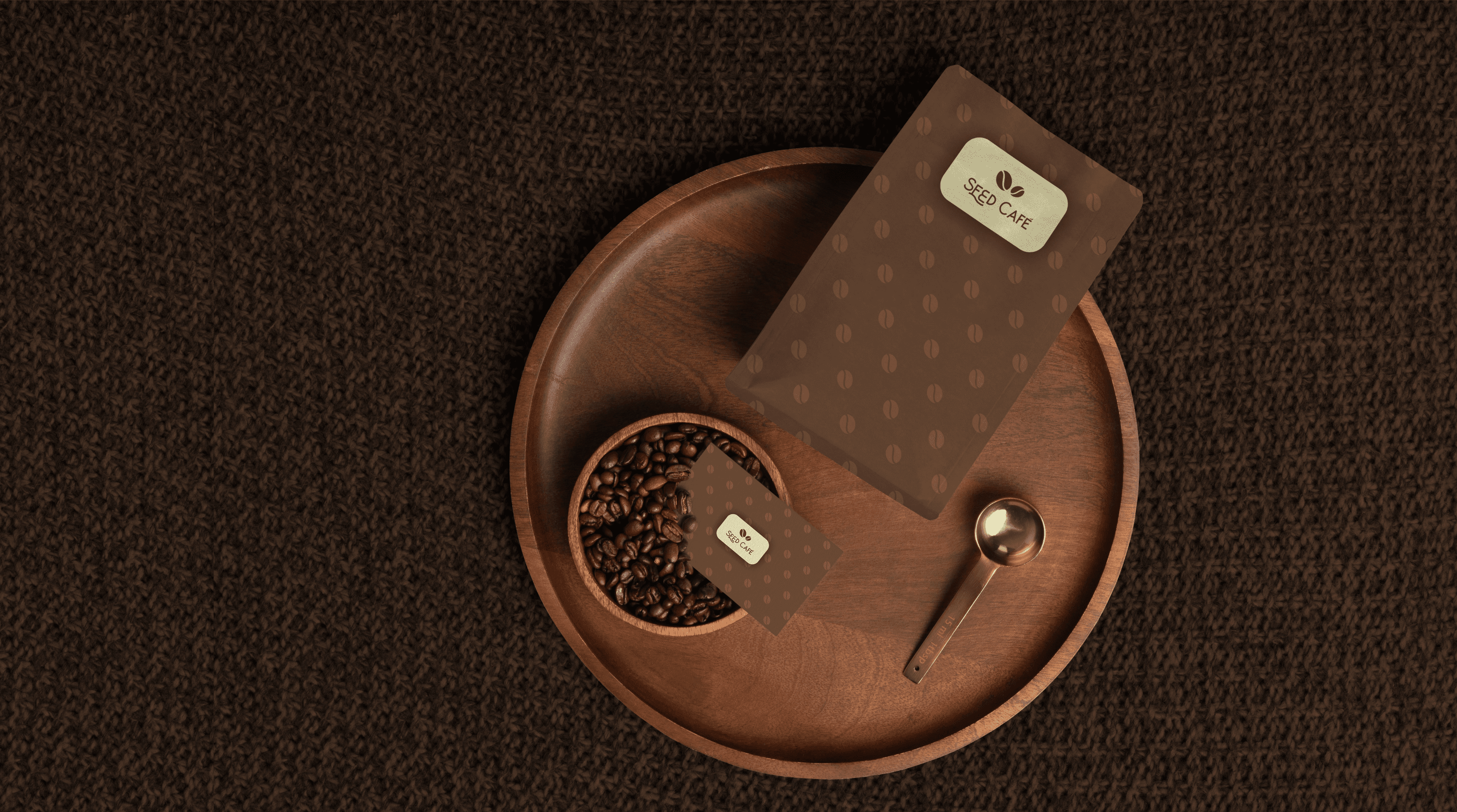
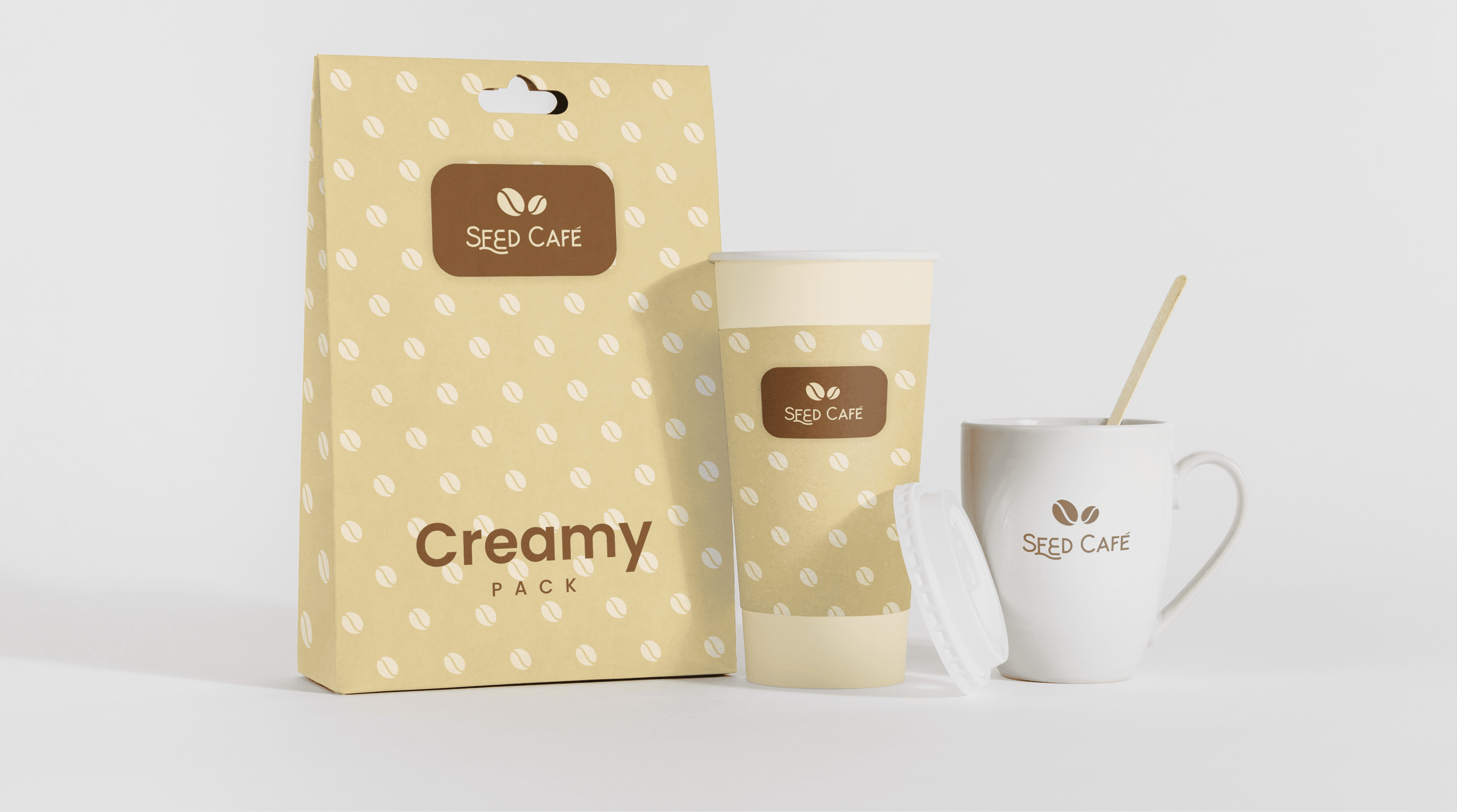
For the visual identity and color palette, I selected coffee creams, espresso, ash, white, and coffee bean shades. As for the logotype, I came up with a simple and unique coffee bean design with a very classy font to complement and give a timeless look and feel.


COLORS & PATTERN
In the color palette, I selected calming colors to complement the brand (coffee creams, espresso, ash, white, and coffee bean shades), as well as the best pattern fit for the brand with respect to the brand core values.


FONT
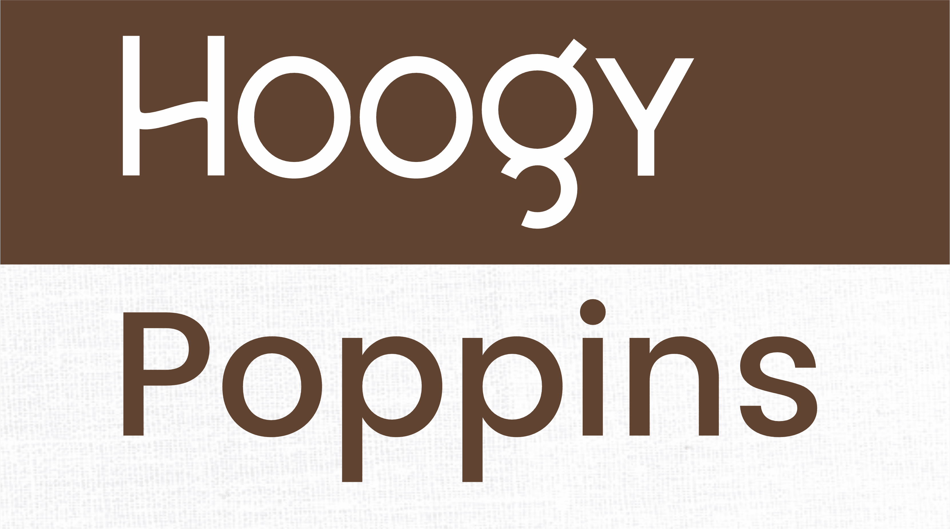
To convey the traditionalism of the brand without being too aggressive or too cold, I chose Hoogy and Poppins as the fonts to use throughout the branding process.
LOGO VARIATION
Having various logo variations ensures the brand is consistent across all design assets and digital platforms. The variations are intended to accommodate different mediums or usages. Each logo variant is used in a different way to suit the brand.